Case Study: The wrong way of marketing luxury

Image 16.png

On Thursday, June 29, 2019 I received an Alton Lane marketing email promoting the Crawford Hopsack Blazer. There are many other ancillary issues we could talk about, but I’m limiting this discussion to the main image of the model in the hopsack jacket and its respective product description. I’m not going to delve into the marketing/online sales aspects, subject lines, calls to action buttons, etc. — but suffice to say I could discuss all that just as extensively and write another ten pages.

Alton Lane used a bland wall for a backdrop, which does not provide any stylistic context. I used PhotoShop to excise the model from the bland surroundings and place him on a Greek island. Now, this stock photo of Greece behind the model isn’t my first choice, but again, it would take a couple of days to cull thousands of images to find the perfect summertime background with a semi-downward view (because the camera is pointing downward, and it’s as if he’s looking over his shoulder and downward). In this case the Mykonos steps seemed to work.

The horizontal handrails behind the model interfere with the jacket silhouette, and add nothing to the image since it’s just cheap pipe handrail and not, say, a beautiful iron railing or marble balustrade (which the model should be standing against). Site scouting and shoot location is very important to display the product in an environment that adds value to the overall look and brand. A handrail that looks like it’s at the local post office or hospital doesn’t enhance anything.


Original image was of model against beige wall; my Photoshopped image has him in Greece, with various enhancements made:

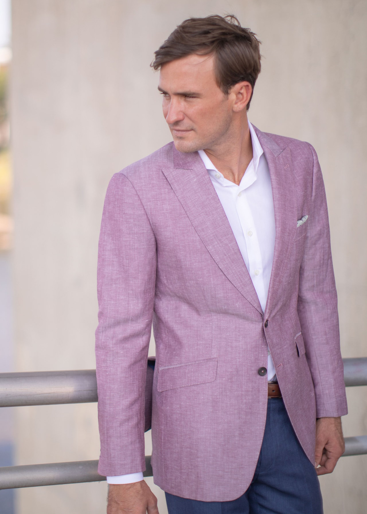
I would have chosen a different image altogether; the model appears to have one eye closed as if something is stuck in his eye, and he has bedhead with an Alfalfa (I Photoshopped the hair but can’t easily change his eye). It’s not a great angle partly because it’s creating the illusion that one arm is several inches shorter (though guys with uneven arms would make a great market niche for custom clothes).

The jacket sleeve drape has some sharp bends and wrinkles which should have been steamed at the shoot, or Photoshopped, before it went public. There’s fabric pulling across the waist which I retouched a little, and I smoothed the sleeve line and shoulder line a bit.

Most creative directors, photographers, stylists and retouchers don’t know menswear suiting conventions and don’t know how suits should properly fit or look. The missing shirt cuff is considered an unforgivable sartorial sin among bespoke aficionados, and it’s something I’ve seen before in Alton Lane’s images. Alton Lane is losing prospective customers over minor details like this — details that suiting aficionados obsess over. It’s little shortcomings like this that are separating Alton Lane from the upper tier of great bespoke suit retailers like Kiton and Brioni.

What immediately struck me (and I notice this in many low quality jackets) is that the hopsack jacket has a buttonhole in lieu of a proper lapel hole. Suit aficionados consider this another sartorial sin and will take one look at it and move on to other brands. I could be wrong but it also appears that the buttonhole stitching doesn’t even have a hole, but is only a decorative “shamhole.” If that’s the case then bespoke clientele will consider this blazer on par with, say, H&M or Express, even if the rest of the suit is perfect. There’s no way to sugarcoat it. It might cost Alton Lane a few more dollars to do it right, but I know doing it wrong is costing them the high-end prospective customers who spend $5000+ on a suit. Prospective customers take one look, assess the details that are invisible to the average guy, and move on. It’s nothing personal.

When you consider the best athletes or teams you have to ask what separates the greats from the also-rans. It’s often a fraction of a second, or a single point. It’s the same with luxury menswear. A Kiton/Brioni suit and an Alton Lane suit are (most things being equal) 95% the same if the cloth is the same, with only minor details that separate them. If Alton Lane were to bring the product quality closer in line with the top Italian houses while creating a stronger brand story and showroom environment the company could capture a decent percentage of customers from the top luxury menswear houses.

Alton Lane’s overall merchandising/sales presentation and copy is very weak, and could be far more captivating and seductive:

Why is it called Crawford? It sounds to me like there’s a whole story behind the name that isn’t being told (sold). People like stories surrounding products. In fact, the whole Alton brand should tell a story - but it doesn’t. All it does is discount prices and barrage people with sales.

Most guys have no idea what hopsack is, what it feels or drapes like, or why it’s good for hot weather. The materials and open weave structure are not described in the email presentation. For all most guys know hopsack could be a type of polyester. Even on the linked product page the materials are not listed (I contacted Alton to find out what the materials are, so maybe someone got the memo and listed them by the time you read this). Nowhere does it say that hopsack breathes. Maybe call it Summer tweed? Maybe compare/contrast it to pure linen? Maybe pair it with linen pants and sell its “cool” factor? I would also add something about the lining, if there is any lining. Alton Lane could say this jacket can go unlined or only have the upper lined.

In short, the product description should carry more meat on its bones. We could mention the peak lapels, and what I think is the jacket’s highlight - the stylish canted pockets. Single vent? Side vents? It doesn’t show or tell. I am honestly not sure if the lapels, vents, pockets and buttons are fixed by default, or customizable. If it’s all customizable it should describe what options we are seeing in the photo. In any case there should be a 360 view, too. More information equals more confidence in buying. The copy is very weak in terms of style and information.


Alton’s Existing Product Copywriting:

Image 6.png
 

There’s some style and grammar issues with the copy. For one, it’s implying that the hopsack (i.e., the blazer itself) is imperceptible from afar. (Emperor’s New Clothes?) What they mean to convey is that the intricate weave of the hopsack is imperceptible, so it should read something like “when seen close-up, hopsack reveals an intricate weave that is imperceptible from just a few feet away.” The light gray text is hard to read on a computer and, like the weave, almost imperceptible from arm’s length on a phone display.

The existing product information copy leaves out key sales points about a hopsack blazer geared to summer wear - its ability to better allow air circulation and avoid wrinkles when packing for a weekend at the beach. Here’s a couple of attempts at copy….

Josh’s Copy Re-write:

Image 13.png
Image 18.png

The color is described as Rasberry, but the particular color in the photo as I see it is Lilac or a shade thereof. I understand the individual threads may be more rasberry or burgundy but the overall color perceived is lilac.

It’s more confusing when we go to the linked product page where two other colors are used to describe it - Burgundy and Rust. Also, on the product page the jacket appears to be two different colors - it appears as one shade in the outdoor shot and another shade in the studio shot. This reduces confidence in buying because the buyer asks himself what color is going to actually show up? Clarity regarding color reduces returns. The colors could be easily matched in Photoshop with the actual garment or properly calibrated during the shoots.

 
Image 9.png
 

Color confusion. Which color is it? Left or right?

The shirt and pants and belt and pocket square are part of the outfit shown and should be offered as a complete set for a discount. The ensemble is confusing because below the image of the model you offer a white dress shirt but it’s not clear if it’s the same shirt the model is wearing because we can’t see the diamond pattern on his shirt [if it’s the same shirt there should be a detail image that allows us to see the shirt pattern close up against the blazer lapel or collar].

A navy/black alligator belt is offered in the email, but the model is wearing a brown leather belt — more confusion. Does the alligator belt come in brown like on the model? Where can I find the belt on the model? I know the answers are obvious to Alton. They are not to the prospects.

Some customers love the pocket square shown on the model and want to buy it. But there’s no description of it or link. Lost potential sales.

Some customers love the pants the model is wearing and want to buy them. But there’s no description of them or link. Lost potential sales.